In this age of ubiquitous information, knowledge workers and organizations can be overwhelmed, even paralyzed by the mass of data presented to them daily, unable to make sense of it all. Our ability to collect data has increased exponentially as our lives and careers have become increasingly digitized. From e-commerce transactions to bodybug health sensor info to digital video capture, we produce more data than we can hope to consume. We have too much information to analyze and don't quite have all the right tools to do it yet.
It's no wonder then that, as a solution to this problem, information visualization techniques are becoming so popular. Infovis is indeed a new language and its drivers for adoption are not just our daily data overload, but also our increasing emphasis on visual communication.
Here at Involution, as a part of the software interfaces we design, we're often asked to create visualizations to help users understand massive data sets. Whether we're designing a dashboard, system analytics, or some other form of trend analysis, we're always focused on making the visualization task oriented and valuable to the user's workflow. Like any set of communication tools, infovis can have its design pitfalls. Most notably, it's relatively easy to fall into the trap of emphasizing appearance over communication, giving the user too much ink and not enough data.
At Invo, for our data visualization work, we often draw upon code libraries and frameworks. Here are a few that we find to be most valuable:
D3
D3 or Data Driven Documents is a relative newcomer, so far as Javascript visualization libraries go, created by the same team that brought you the wildly popular Protovis.
D3 is a lightweight and flexible open source library; its power comes from its use of Web standard technologies like HTML5 and SVG. D3 allows you to bind data to a Document Object Model (DOM), and then manipulate the document as needed to render beautiful visuals. D3 pushes the edge of infovis with fun, useful, and sometimes mind bending possibilities including everything from scatterplots to treemaps to choropleth maps.
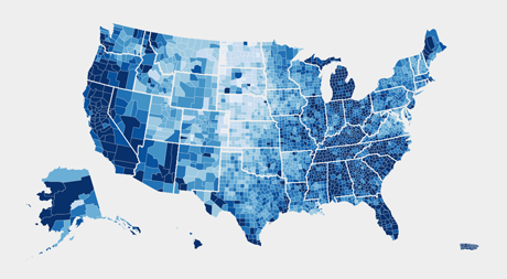
An example of a choropleth map rendered using D3
Protovis
Even though it is no longer under active development, Protovis holds a special place in our hearts as the progenitor of D3. It has many of the same visualization capabilities, and created by the Stanford Visualization Group, Protovis is free and open source, distributed under the BSD License. Like D3, Protovis uses Javascript and SVG for Web standard visualizations.
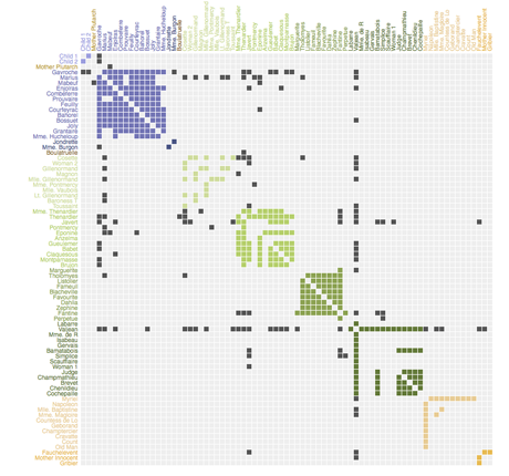
A matrix visualization created in Protovis
Raphael
While Raphael is more of a general purpose Javascript graphing library than information visualization powerhouse, it is a great choice for simpler graphs and charts. Raphael's primary claim to fame is its support of not only modern browsers like Firefox, Safari and Chrome, but Internet Explorer 6.0 as well. The charting plugin, gRaphael provides options for simple line, bar, dot, and pie charts. Like D3 and Protovis, Raphael is also an open source library; it's distributed under the MIT license.
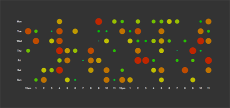
A dot graph visualization in Raphael
Flare
Flare is an Actionscript library for visualizations. If your technology preferences lean towards Flash, it may be a good choice. However, the negatives associated with Flash are many including slow system performance and various security issues. And, if you're interested in handling large data sets your efforts will be constrained by the data handling limitations of the Flash player runtime. Flare is open source software, released under a BSD license.
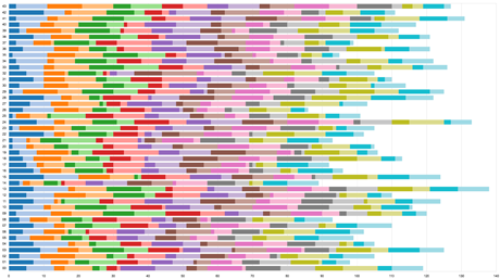
A bar graph visualization rendered in Flare
Business Intelligence Infovis
Also worth mentioning in this list are Tableau and Spotfire. In contrast with the above mentioned libraries, Tableau and Spotfire are complete commercial software packages, aimed at the Business Intelligence and Analytics users who require infovis dashboards, rather than viewing charts generated in Excel.
It's safe to say that, while our data rich future may be uncertain, there's no doubt that it will be visualized.