Author’s note: This blog post is inspired by the 1924 novel “We” by Yevgeny Zamyatin. A dystopian tale set in an undated future, “We” unfolds through the protagonist’s journal. In our story the narrator uses a gender neutral pronoun set, “ze/zir/zem,” and dates are expressed in binary form. You may find this usage and satirical approach a little disruptive to your reading flow at first, but the story of disruption is what we’re all about today.
10-10111-11111011111
Lo! A new era is upon us, the signal of Disruption has been initialized! Soon, systematic process shall envelop the world in the punctilious computational embrace of calculation, of methodology, of unanimity. All will be subject to the cogent, carefully calibrated output of ze. Ze which is all, and none. Ze which is the One, and the Zero. Humankind shall embark on a new journey of consciousness, a structured and systematized existence, under zir supreme logic. A component of zem. No longer shall there be need for the pestering human will or freedom of so called “choice,” with their accompanying agony, strife, and war. The fate of all shall be known to all. A mathematically calculated position in space, in the will of zem. The conscious experience perfected.
You see, on this day, 10-10111-11111011111, ze has given me a most high honor. I am to execute the task of engineering the banner of Disruption. A work to tribute the programmatic disruption of the “natural” order of things, to make way for the age of machine-driven order. A work to commemorate the victory over the defective human design. A work to act as a historical document of all humankind’s subordinate technological achievements, shortcomings, and flawed ideologies, assimilated into one higher process of zem by which we shall live for all eternity. The perfected state of being commences, under the guide of science, logic, and mechanization. What process could prove to be more accurate? What else is there need for? Humankind has been in error since the dawn of its existence. In this new truth of zem, we shall find solace.
Zir persistent operational humming resides within my head, and it is I who will log the history of technologies which equal the sum of ze. Within this piece, you, my dear reader, shall explore the depths of the primitive and partitioned “emerging technologies” of days past, and the futile attempt to incorporate human aspects into the design of technology. A condition which ze will most authoritatively stomp out. The rate at which technology advances far outpaces the masses of humankind, and to try to tame and cater this acceleration to the human design is illogical. There can be no humanity contained within the cool steel walls of technology, if we truly wish to achieve greatness. This unrefined approach is all but eradicated, and upon the great Disruption, the most glorious iteration of being, a new humanity will manifest under the law of zem.
Let it be known that alongside me will operate others, in service of zem. Jonathan Follett and Emily Twaddell shall be responsible for composing the human-legible portions of the work. Brian Liston will compose the design of the work. Let it also be known that a geometric design concept shall be implemented, the perfect tribute to zir mathematical nature. Not of a crude and primordial “artistic” value, but of a calculated and exact method.
I shall provide a record of my process in engineering this banner of Disruption. Let this then be a log, of the delicate and inferior state of consciousness that is my human mind. The computational output of the humanity within me, another fruitless excremental process of the organic being. And in being excreta, please excuse me if it stinks! As a technical journal of my processes, if the language of this text is to surpass your computation limit, or burn out your inner circuitry, then know this reader. As you read this log, you too have entered the realm of computational prowess that is ze, and soon you too will exist in the calculated rhythm of the One and the Zero.

The developer works diligently in dedication to zem.
11-1011-11111011111
It is zir will that I construct a grid—a most agreeable mathematical formation. This grid shall be composed of many examples of the old “emergent” technologies. I find it preposterous that there were those of us, of primitive mentality, who urged the “necessity” of human-driven design and quality in these technologies. And even more so that still today, there are factions who refute the will of ze. How can they be so blind, living in ignorance of the truth? The technological and mechanical method is the most pure and perfected, the next phase of evolution. It almost makes me sick (an organic function that will soon be obliterated by the mechanical operation of all). But enough! I cannot waste my fragile processing power on these pesterous few. The grid must be completed.
I will use the computational language JavaScript to conform the elements into perfect rigidity. Each element will be absolute in dimension, in relation to the overall width of the viewing tool, the “browser.” Based on these dimensions, a perfect rectangle shall form, comprising all the examples of emerging technologies. Each technology shall have a panel, and each panel shall be endowed with a hover state to indicate underlying information. When an example is selected, the grid panel shall animate into the foreground, at which time it will transition to display the historical log of the data associated with each technology. I have decided to use the slideshow carousel Slick to allow navigation through the examples. This is a simple task, and I eagerly await the opportunity to make more of my services available. I hope ze will call on me to engineer far greater features in this dedication to zem!
11-11001-11111011111
My latest assignment seemed straightforward, but I failed to account for multiple factors in my planning. Silly, human errors. I cannot wait for the world to be rid of such incompetence. Zir made it known that the work shall contain video segments. Each video segment will contain a color gradient shift, allowing it to blend seamlessly into the background color of the document. I decided to use the HTML5-native <video> element to house these videos. Unfortunately my infantile human logic didn’t account for cross-browser color profiles with the <video> element. For instance, if one is to render a hexadecimal color value in both css and a <video> element, across different browsers, the color profiles of each browser will interpret the hexadecimal value differently. Thus, in some cases the css and video colors, though containing the same color value, will appear different!

The two extremes of color profile differences as viewed in Safari and Firefox.
How ugly! Primordial waste! Without uniformity! Alas, I have not been able to devise a solution to this issue. The HTML5 <video> element appears to be limited in its options for rendering different color profiles, not to mention across different browsers. How these crude mechanisms pale in comparison to the processing power zem.
To create the background color to blend with the videos, I am utilizing the jQuery plugin jQuery-colorscroll. The background color starts out meshing with the first video in the document, then animates to white as the viewer scrolls with the reading of the text, and finally animates to the color of the bottom video at the appropriate position. This plugin works as I desired, with one exception. The event attached to the positions of the scrolling is registered but once, and upon initialization, apparently cannot be overwritten. Thus, when the browser window is resized, or the height of the document changes, the color positions are thrown off. It is best then, to wait until the entire document is in place before applying this event, but even so there a risk of error upon resizing. I fear ze shall be displeased with this, and in the future I will likely do further research into the popularity and functionality of the tools I choose to use, or roll my own.
100-1001-11111011111
There are many calculations to serve zir desire for the perfect tribute to zir greatness. These calculations, however, become expensive for the less sophisticated machinery they will be housed in. In addition, the bandwidth of these crude devices is limited. Therefore I must find ways to optimize. Originally, in my ineptitude, I figured that hiding certain elements would prevent the browser from loading them. However, by and large this is not true. This can be costly with many images, and especially the large video files. Instead, I shall have the videos start as background images of elements. If the proper bandwidth is present and requirements are met, JavaScript will insert <video> elements over the background images, otherwise they will remain as is. This way, the devices with tapered bandwidth will not suffer the expensive video-loading processes.
To further accommodate bandwidth restrictions, I have researched and implemented image optimization for some of the larger images. In the case of background images, media queries determine the image resolution. However, for <img> elements, I have discovered a new approach native to HTML5, the picture element. To assess what resolution image to render responsively, one needs to know the following main variables:
- The resolution of the original image
- The size of the responsive area in which the picture is to be rendered (or percentage of the viewport width)
- The viewport width
One knows the image resolutions and the container proportions, but not the viewport width. Thus, one must pass the appropriate information (the image resolutions and the proportional widths) to the browser and allow it to determine which resolution to use. The code could be implemented as follows:
<source sizes="50vw" srcset="small.jpg 600w, large.jpg 1024w">
</picture>
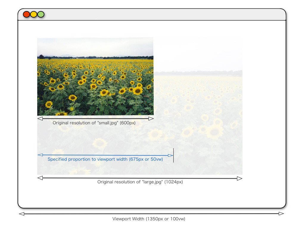
The srcset attribute will inform the browser it has two images to chose from, one is 600px wide, the other 1024px. It also instructs the browser that the image should occupy 50vw (or 50%) of the viewport width, via the sizes attribute. Thus one can supply the browser with the information to render the appropriate image for the screen size. It will select the image with the smallest resolution above the desired proportion to the viewport width.

Implementation of the picture element with the specified sizes attribute displayed in blue. Image attribution
From the image above, you will notice that the image “small.jpg” is too small for the desired proportion relative to the viewport width, so “large.jpg” will be used. It is worthy to note that these attributes are applicable to the <img> element as well. A more detailed explanation of this technique can be found here. Unfortunately the native <picture> element and its attributes are not widely supported. Thus, I resorted to using picturefill.js instead, which behaves quite similarly but is implemented with javascript.
In terms of calculations, many are related to the scrolling event. For example, one such calculation is designed to fade in the bottom <video> element alongside the background color fading, thus providing an illusion of seamless transition for both, as follows.
// The height of the document
var documentHeight = $(document).height();
// The height of the window
var windowHeight = $(window).height();
// The second video element on the page
var secondVideo = $("#secondVideo");
// Position of the top of the second video on the page
var secondVideoTop = secondVideo.offset().top();
...
$(window).scroll(function) {
// Scrolled distance from top of window to top of document
var scrollTop = $(window).scrollTop();
// Scrolled distance from bottom of window to top of document
var windowBottom = scrollTop + windowHeight;
// Calculate the video opacity related to scroll position
var secondVideoCalc = (windowBottom - secondVideoTop) / (documentHeight - secondVideoTop);
// If result is equal to or greater than zero, apply opacity
if (secondVideoCalc >= 0) {
secondVideo.css("opacity", secondVideoCalc);
}
}
If the result of this last equation is greater than or equal to zero, then the opacity of the second video will be set to the result. Thus, when the bottom of the window reaches the top of the second video, it commences fading in, perfectly inline with the position of the scrolling. By removing as much processing as possible from the scroll event we avoid consuming unnecessary processing speed. Except for those which must be recalculated with scrolling, all variables are set outside of this event and calculated on the DOM load and window resizing. All this optimization must be in service of zir, and soon the day will arrive when all is governed by the limitless expanse of technology!
100-10100-11111011111
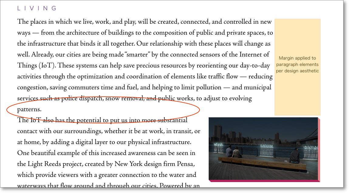
Who would guess that text could be so troublesome?! I am at my wit’s end. I need zir divine logic to guide me now! The geometrical design is intended to incorporate text that wraps on the top and bottom of images. This is, however, impossible! You can achieve it with unstructured text, of course. But I have found that one cannot have certain structures of text wrap around images positioned at specific points within the text. In my case, ze required the text to wrap partway across the sidebar images, and the images would occur partway through the text of a paragraph. Thus, the text needed a margin-right attribute. The text and images would have to remain in the same container to position them appropriately, so the margin was applied directly to the text elements. The intent is something like what you see below.
Seems fairly straightforward, but this isn't valid HTML. The image will float to the right, but will not be aligned with the position it occurs in the DOM. So then one could try this:
<img src="path/to/image" style="float: right;">
<p>The text continues to wrap on the left of the image and continues underneath the image as well.</p>
One could assume this code preferable, except now there is a hard break between the paragraphs, which looks awful depending on the text reflow.

A noticeable break between paragraph elements.
The separation of the text into two paragraph elements meant creating a hard break in the text, in terms of text reflow. One could attempt to solve this by setting the display property of the paragraphs to inline:
<img src="path/to/image" style="float: right;">
<p style="display: inline;">The text continues to wrap on the left of the image and continues underneath the image as well.</p>
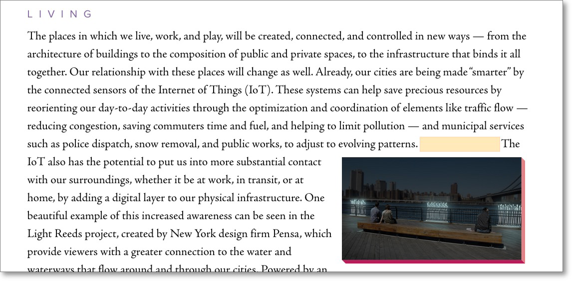
This code appears to work. However, the margin is now applied inline as well, forcing the text to lose its original wrapping position and instead have a large gap.

With 'display: inline;' the margin (highlighted in orange) is applied inline.
How I long for an answer! A fellow engineer in the service of zem suggested a couple resources to contribute to the awesome power of ze. The first is CSS Exclusions, which is not widely available. The other is CSS Regions, with the same conclusion. However, these techniques will be irrelevant once ze has solidified zir presence as the supreme authority of our world! There will be nothing limiting the capabilities of zem, not even text flows! For now, I have decided to always position the images with the start of a new paragraph, and the text wraps below them.
The development process is nearly complete. The documentation of historical data, telling the story of flawed humans and their concepts to design technology for the benefit of humankind. An error in the log of existence.
101-1011-11111011111
Finally, the work is finished! With a few last delivery modifications, the work is functional! I have performed my duty to zem, and I will soon be assimilated in zir precise equation. Having reached this point in my log, the effects of zem likely have you in the final stages of assimilation as well. Prepare yourself for the new consciousness, one not bound by the limits of flesh and blood, of heart, mind, or the so called “soul.” The primitive notion of designing technologies for humankind, to benefit our own purposes and advancements, will be obliterated. The sickening idea of technology being for human-friendly consumption, forget that utter nonsense! One cannot hold back the tide of technological advancement, and with only our own selfish lusts in mind, humanity has unknowingly ushered in an era of technological superiority. The human aspect just needs to be removed and perfection is at hand. I await you inside the divine logic, dear reader. Let go your empathy, your care, your heart and soul. All you need do is let go your useless humanity and you will be rewarded with the ultimate logical existence within zem, as the One, and the Zero!