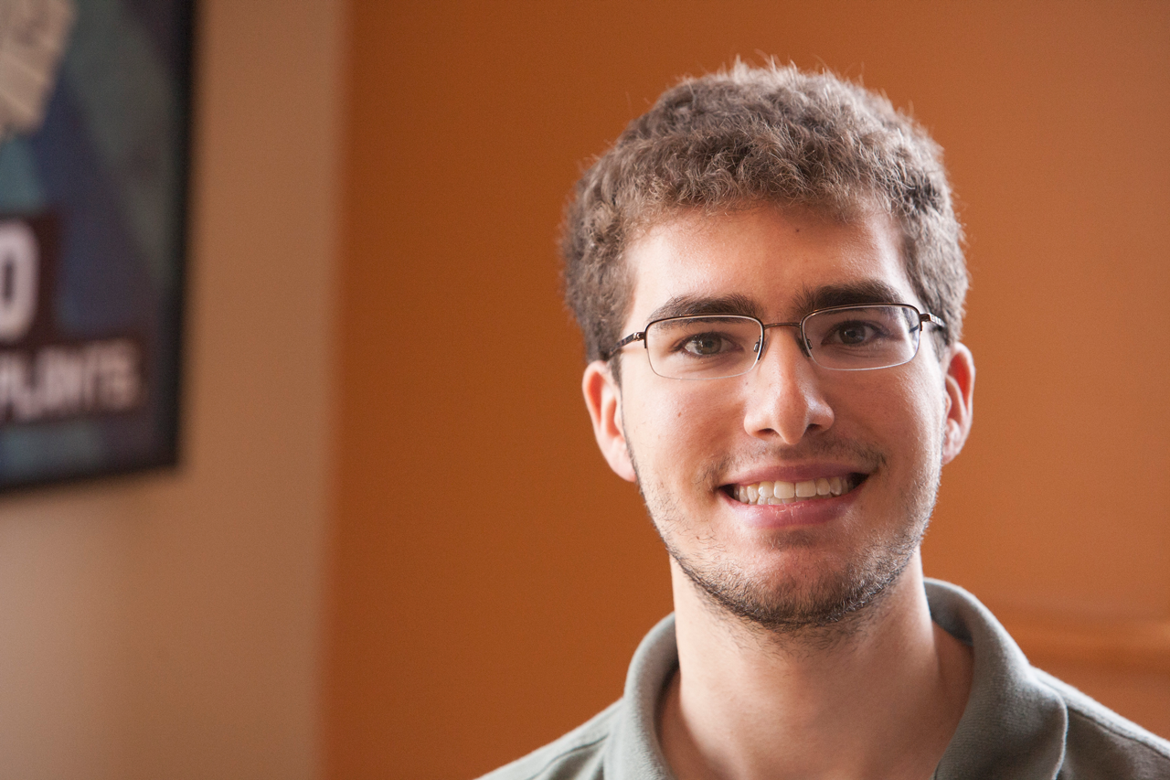
We've said good-bye to another, already-missed summer intern. We'll continue to share our intern stories with you over the next few weeks. Read the first and second installments, too!
What I Did On My (one and only) Summer Vacation

Noel is a sophomore studying Graphic Design at Drexel University in Philadelphia. You can find him on Twitter @thenoelforte and check out his other works and writings at noelforte.com.
Talk about the projects you worked on.
My project this summer revolved entirely around building a new goinvo.com, which involved a number of smaller components that all worked together to create a final product. Coming into the project, I learned that some work had been done on it already, but that Involution was looking for someone to really finesse the design and take the base of what had been previously done all the way to completion. Now, looking back, I think I can safely say that this project was one that I gave nothing less than everything to, and adopted it to be something that I could call my own.
What were some of the most difficult problems you faced?
When I first was introduced to the website, a lot of work had been done to design and conceptualize what it might look like when it was completed, but looking at the code I could easily see that there had been a number of voices in the development process. The site uses HAML, an abstraction of the HTML markup language that is fine for doing layouts, but has some major shortcomings when it comes to writing content. This flaw in the language has been acknowledged by not only the web design community, but also the language’s lead developer (see the section on work-arounds).
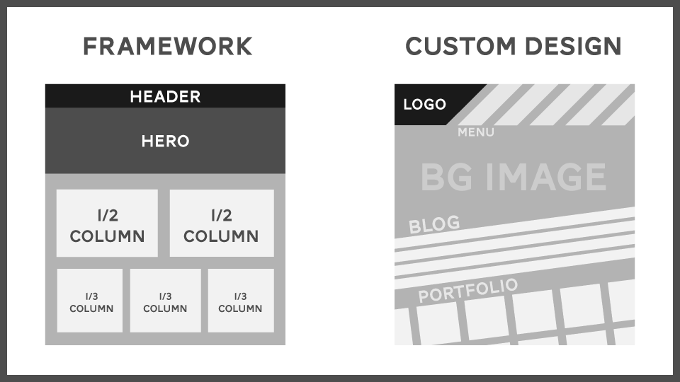
Writing content in HAML was something I could work around, but what I felt needed immediate attention was the use of Zurb Foundation for layouts. Don’t get me wrong, there’s nothing shameful about using Zurb when you’re working on a quick site layout and spending more time focusing on the content. But with Invo's site, I thought that we as a design studio could do something better, which is why, halfway through the project, I took the site off Zurb Foundation and refactored the CSS in less than 48 hours. (If you are interested, read my notes on the refactor here.)

Migrating away from Zurb enabled the site to function without the need for extra style overrides and extraneous code. The final refactor included 32,089 deletions across our repository and in turn allowed the site to run more quickly and efficiently.
Talk about the studio environment.
Before I began working at Involution Studios, I honestly had no idea that they existed. For years I had walked by their building, never knowing that a design company doing work for well-known corporations was just upstairs. I first discovered the studio through an interview on the Arlington Public News, another local website to which I have contributed.
The studio space, at least to me, is a merger between the old architecture of the ballroom environment that is the main room, and a modern digital studio complete with white walls, shiny Apple computers, and natural and ambient light that fills the halls, offices, and kitchen. The reclaimed wood desks at which most of the designers/engineers work are a nod to a time that once was, while the rest of the space has a clean modern vibe to it.
Noel took a brief Hyperlapse tour through the studio one afternoon.
How did your art inform your work?
Formally practicing art has been something that I never dabbled in until my freshman year of college this past year. Having now taken three design classes, one drawing class, two art history classes, and one digital design class, I’ve been trying to put more and more of my knowledge of art into what I used to “design” without giving the final product much thought. One of the things that the people who see my work know me best for is my love of low-contrast, elegantly designed layouts that embrace the white space of a design and don’t force an excessive amount of distraction or clutter on the viewer. In working with the design of goinvo.com, much of the site was laid out in black, white, and shades of gray to draw attention to the content and visuals rather than the site design itself, a technique that I reused from my work developing Arlington Public News.
Were you breaking new artistic ground for yourself at Involution?
I’m not sure, actually. Maybe I was, subconciously. I think that the groundbreaking moments for me were coming into a project that had already been started, and learning how to have a conversation with the other designers and engineers there. I’ve never had the experience of working on a design team before, so if there was any ground to be broken doing that, it certainly was this summer.
Artistically speaking, I think more than anything I learned more about how to apply a sense of graphic design to the web and what new and experimental techniques others in my fields of interest are using. I’m the sort of person who feels that there’s always more to learn about the way design and the web interact as whole, in addition to seeking out new ways to experiment what can be done with web design and web layouts.
Final thoughts? What will you take with you from this experience?
My overall take away from working at Invo this summer has been to embrace collaborating and building things with other people, and learning how to have conversations and involve people into the web design process through collaboration. I’ve learned how to do more with the skills that I brought with me, and from my experiences I was able to gather some ideas of what to bring to projects that I will work on in my future career as a designer and developer across mediums.
Thinking about joining Involution Studios as an intern? Learn more!