The leaves aren’t falling quite yet, but the sun is already setting earlier and the UHauls are showing up on the streets of Cambridge and Boston. It’s time to say farewell to our fantastic summer interns. We’ll be sharing their stories with you over the next few weeks. It’s been pretty amazing!
What I Did On My Summer Vacation

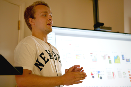
Quentin Stipp (left) is a rising junior at the University of Massachusetts, Amherst, studying digital art. Noah Baker (right) is a rising sophomore at Washington University in St. Louis, studying Communication Design and English.
Talk about the projects you worked on.
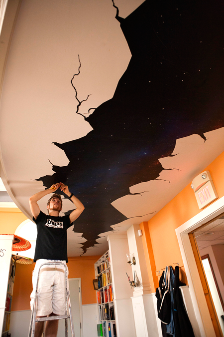
Quentin Stipp: I was astonished the first time I set foot in Involution Studios. Walking into its nondescript building in Arlington on my first visit, I expected to find a typical office. Instead, I found a cross between an antique ballroom, an Apple store, and a hipster coffee shop. My appreciation of the studio as a kind of large display case for clever designs was probably what inspired my first project, an installation on the ceiling of the indoor balcony, intended to give the impression that a massive fissure had opened up a view of the night sky.

Additionally, I made illustrations for a presentation about non-invasive health monitoring systems that could be installed in people’s bathrooms. I created sketches for a section in a book about emerging technologies, and, over the course of my internship, also made whimsical portraits of the staff.
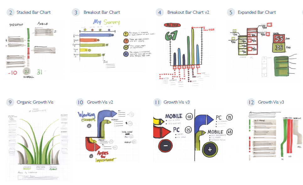
Noah Baker: My “thing” coming in was that I made cool stencil art a couple times in high school and college. As much as I love that “thing” I was really hoping to get genuine studio/design-firm type experience as well. I started out doing a research project on CHIA, which was a bit dull, especially as a first assignment. However, having a two-week deadline to present to the whole studio (whom I barely knew) motivated me to finish strong, and see what lay ahead. What lay ahead was a colorful re-do of a client’s survey analysis application.

I was immediately partnered with designer Sarah Kaiser, and we started sketching. Sketching what? I wasn’t really sure. But at each stage, Sarah and I would convene and plan out our ideas for the next stage. At first, I was happy just to get a pat on the back saying, “Cool idea, Noah,” but eventually Sarah and I would truly be working together to deliver our product. I stayed on SSI with her as Invo moved on to the next stage of work for SSI. This project required a completely different approach, more focused on grouping information efficiently and finding ways to showcase relevant data. Throughout my time, I also sketched a crazy amount, mostly for an as-of-yet unfinished alleyway mural piece (maybe someday).
What were some of the most difficult problems you faced?
QS: The ceiling project continually presented me with both little problems and major challenges I had to overcome. When I first conceived it, I wanted to create an image that based on false perspective. (This would mean, among other things, that if you stood in one place it would look as though supporting pillars were projecting up into the ceiling.) But this turned out to be a nightmare of planning and positioning, forcing me to change direction.
I came across the idea of displaying a large, fake crack on the ceiling from looking at sidewalk art. But I needed more than that to make it visually interesting. Eventually I decided that depicting an image of outer space through the crack would work well—it would both simplify the perspective issue and fit with the whimsicality of a giant faux crack. However, having never printed such a large piece before, I failed to realize how big the digital image would have to be in order to print correctly. The final image was nearly 5 gigabytes and almost crashed my computer every time I opened it. When I finally finished tinkering with cut lines and problems with image resolution, I sent it off to the printing company Blik.

The most difficult challenge of all came when we received the image printout as a set of giant stickers and had to put them up on the ceiling. Each of the seven sections into which the image was divided was so large that at least three people standing on ladders were needed to put them up. I spent a week agonizing over how to make sure the sections would be perfectly aligned in the irregular ceiling space they were designed to fit into. Finally I gave up trying to figure out the optimal technique and just went ahead and stuck the first one up. Luckily, the positioning came out better than I had expected—it was nearly perfect. But the sticker wound up with some bubbles and creases. We did what we could, but there were only so many bubbles we managed to flatten out. Luckily, we figured out how to put the rest of the stickers up by cutting them into smaller pieces, avoiding bubbles in the remainder of the image.
NB: One of my biggest issues was getting into Idea Funks. I would sit there in front of an empty page, or worse, keep hammering out slight variations on the same idea. Then I’d nail something, think it was good, and then just kind of wonder what would happen next. Some great doodles happened in those Funks. These mental walls I was hitting were also related to my time management. Eventually, when I was fully involved on a client project, I could go for hours on a couple ideas. But before that (and at times, during) I had trouble sorting out priorities. Should sketch-time be pre-lunch? Throughout the day? With music? I sorted these things out as I went until I found a routine I was comfortable with.
Another big one was balancing independence and reliance on others. Obviously there was a lot I didn’t know about UI/UX/Photoshop/Clients/Life, but I didn’t want to annoy people or ask too many questions. But once I started asking questions, I got the feedback necessary to point me in the right direction from Sarah, Juhan, Jon, and others.
Talk about the studio environment.
NB: At its core, it’s just a really cool place. You know that when you walk in. When I told friends and family about the studio itself—the high ceilings and windows, the wooden balcony, the lit trees, massive old desks, and massive shelves of color-coded design books—they all rolled their eyes and smiled with jealousy. Of course I would end up here. People my age are either serving coffee at Starbucks or serving coffee at a law firm, and to have an internship in such an awesome place, surrounded by people who shared my passions was an unheard-of college commodity. And the people really are what transformed my experience from a cool opportunity to a genuinely interesting learning experience. Not only were they willing to share their lunches and their coffee, they were there when I asked for help. At almost any point in time, I could ask a question, even a pretty basic one, to any of my coworkers. This was especially useful once I was working on UI design, because I had so much to learn from others’ criticism and advice. It was this feedback that made me feel that I was on the same level as my fellow designers, and allowed me to try completely new things.
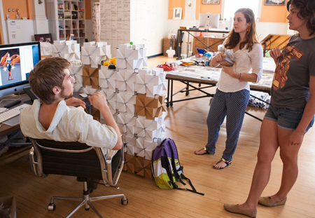
QS: I walked by the building without a second glance for 20 years, and I never guessed that it housed an old ballroom on the third floor that had been transformed into a impressive creative platform. The space invites creativity with its roominess and abundant, witty artwork, as well as with the way its high, overarching ceiling comes into view as you walk into the room—there’s even a balcony. As I said earlier, Involution’s remarkable space had a lot to do with my inspiration for the ceiling piece. In addition, Involution staffers were particularly helpful for feedback on my projects because many of them have some background in art or design. When it came to the actual installation part of the ceiling piece, I relied on advice from several people who knew more about the process than I. The main impression I have of the studio, and one of the main things that drew me to it in the first place, is that it conveys a sense of lightheartedness and an appreciation of intriguing things even if they are not immediately related to the project at hand. Nerf guns are scattered about for occasional battles, and I spent a happy hour one day constructing a castle wall out of some interlocking cardboard building blocks. Creative inspiration sometimes flows better with the aid of an amusing diversion every now and then.
Watch the video of the ceiling graphic being installed. It was an all-hands-on-deck effort!
How did your art inform your work?
NB: For me, sketching ideas for the mural kept my creative brain working. It also served as an outlet when I wasn’t sure where my other projects were going. Though I didn’t directly work with materials that I knew well, my artistic sensibilities definitely informed many of my designs and introduced me to expression in a new medium.
QS: I’ve always been interested in visual representations of things’ internal, functional parts. I find the complexity exhibited by the structural supports inside a building, or the gears behind the face of a watch, visually and intellectually interesting. This fascination with seeing behind the curtain led to the initial idea of illustrating a portion of the balcony ceiling to make it seem as if a variety of structural components were visible. When this proved too difficult to create, I simplified it to the basic idea of being able to see past the building’s outer shell. The whole thing was also visually based on the kind of art I hope to do in the future, creating concepts for video games and movies.
Were you breaking new artistic ground for yourself at Involution?
QS: Though I’m very familiar with illustration, I don’t usually have my pieces printed, and I’ve never worked at such a large scale before. Making art for an installation is a different experience from simply painting in Photoshop, and many more things must be accounted for besides just making the image look nice on a computer screen. Bringing everything together to get the end product was more complicated and demanding than anything I’d attempted before, and it taught me a lot about how to do large-scale art for public display.
NB: Definitely. I initially thought that my summer would be more 50-50 “my art” and “other stuff,” with no promise that I’d be able to contribute directly to projects (because I had little to no experience with UI/UX/Photoshop/Clients/Life). I was very much fine with this, but my true goal was to get involved in the studio’s work, and to be a part of a team, hopefully getting some design experience along the way. And my summer exceeded that summer in every way. Not only was I able to be part of a small team, I was treated like any other designer at the studio as far as my ability to contribute and the value of my own criticisms or thoughts. Once I was fully involved and had a basic understanding of my tools, I was able to get the “my art” part through a totally unexpected medium. I could still experiment with color and form, and bring some ideas to SSI that came from a different background and perspective. This was especially helpful in the sketch stages of both projects.

Final thoughts? What will you take with you from this experience?
QS: Aside from the obvious—new things to add to my portfolio—I gained an improved understanding of large-scale printing and the various complexities involved in it. I’d never before attempted a site installation of any sort, let alone one of such size. Most of the process was new to me, so I was forced to learn on the go, which ultimately gave me a lot more confidence in my abilities although it was daunting at first. I also got a lot of valuable experience working out illustration ideas with different people at Involution—batting ideas around to get the concepts right, and sometimes going through an iterative process to refine them, taught me a lot about the kind of collaborative process I may encounter in the future.
NB: I got a real working understanding of a studio environment, and a great sense of how a relatively small team works together on multiple projects. I was really looking for immersion this summer, and I totally got it. I also got great pointers on design and was able to learn from example with all of Invo’s projects available to me.
I think at least at first, the feedback loops need to be more immediate. I got to a point where I felt comfortable enough with my purpose in the studio to self-direct, but definitely didn’t start there. At some points, all you want is some quiet so you can bear down and do your work, but I started out needing a few more check-ins, critiques, and brainstorming with other people than I was initially getting. I think this was in the spirit of “You’re an artist, you’ll do your own thing and let us know”, but I was happy to have check-ins and critiques.

Invo prepared me to interact with customers and clients, as well as how to effectively work cooperatively on design. Both of these skills will be extremely useful in the future, whether I’m selling my art, doing freelance design, or working as part of a team as I did here.
Thinking about joining Involution Studios as an intern? Learn more!
