
CNN, I promise you: I’m not picking on you intentionally. I just happen to read your news a lot and the way you visualize information really stinks.
On Monday, August 18, CNN posted a short article about the impact of sanctions that Russia has imposed on food imports in retaliation for the sanctions imposed by other nations against them. At the top of the article is a large graphic that combines colour, illustrations, numerical data, labels, and icons to communicate what foods are impacted, the nations that export them to Russia, and what the financial impact is. The problem is that, while it is attractive, the data visualization adds very little to the story being told. There are a myriad of problems with it.

Colour use is puzzling. The use of colour, ostensibly to help differentiate among different nations, is ineffective at that task. The European Union, in blue, stands out clearly. But the United States is orange and peach. Norway a pink-red. Canada a medium pink. Australia a light pink. All of those last four nations blend together colour-wise and the only thing their identifiers really communicate is “not the EU.” This misuse of colour precludes the provision of additional insights for the user regarding the degree to which each specific nation is impacted by the import ban.
The data is terribly out of proportion. Any visualization with wide disparities in the amounts of data being represented should have the objects holding that data physically reflect some proportionality. If CNN had simply made every bucket the same size it would have been less offensive (if relatively impotent), but instead they chose to make one—just one—of the data containers twice the typical size. And they did that not with the largest bit of data, but with the item to which they could attach a cute little picture of a galloping pig. If that isn’t the tail wagging the, errr, pig, I don’t know what is.
Information is used redundantly. The word “million” is a clarifier for the number of dollars being indicated in every single data object. The rule is, any time you repeat the same thing in every line or container, it should be removed from all of them and established outside as applying to all. There is also redundancy in their use of both colour and flags to indicate nationality. But maybe they needed redundancy on this one because of their bad use of colour (see above).
The ordering of information is illogical. It appears to be ordered from highest to lowest, but then sometimes is not, for inexcusable reasons. Pig offal gets bumped up the list so they get to provide their galloping pig with the largest possible runway. The United States’ data inexplicably wedges between the EU and Norwegian data for reasons that are not entirely clear, and then design pushes the U.S. data to read right-to-left instead of left-to-right, contradicting the rest of the data and breaking every convention imaginable. Perhaps the artist was on a heavy dose of painkillers?
OK, so now that we’ve cited all of these issues, can we not just throw stones but create something better? Along with my pal Brian, I think we can! Take a look:
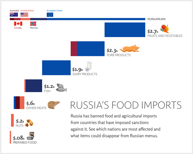
Illustration: Brian Liston
We’ve done a variety of things here:
Colour is used consistently. Each nation gets just one colour, and their colours are crisply distinctive from each other.
More clearly represented the relationships between the amount of exports based on nation, and then the proportional amount of exports based on the type of export. This tells a meaningful data story, unlike the CNN original.
Data is logically and concisely edited. I’m sure there are people who know and understand the difference between “Pork Products” and “Pig Offal.” However, I can assure you that they represent less than 1% of the readership of CNN. Truncating those into a single entry creates less overall data making all of what is shown more useful.
Related data is shown in a useful context. By bringing together, for example, the two “fish” entries into one object it tells a deeper story about that one specific export, fish, for near-zero cost or cognitive overhead.
Information visualization means focus is on data first, illustrations second. CNN bent over backwards to accommodate their illustrations at the expense of the data story. We’ve reversed that emphasis in order to communicate something more meaningful.
Now, perhaps CNN simply wanted something that looked cute and cuddly, and presenting data was not the point. Well, in that case, just draw your cute illustrations and present them without data in the most lovely and engaging way possible. If the point is to enhance and emphasize the data, they need to take an approach more similar to our quick redesign than their own confusing, inconsistent mess.