Dirk Knemeyer on multimedia information design.
Over the past month numerous news outlets--CNN in particular--have devoted extensive coverage to the missing Malaysia Airlines flight 370. While the story is certainly a tragedy, the degree to which its coverage has eclipsed that of stories like the Ukraine situation is a little curious. Regardless, what really raised my ire most recently was CNN’s featured homepage graphic related to the lost plane saga, shown here.
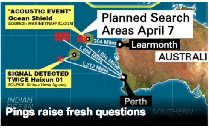
The image that CNN featured in their April 7 homepage headline on was a screen capture from one of the videos associated with the story. Source: Malaysia Flight 370: 'Our optimism is fading away, ever so slightly' By Tom Watkins, CNN. April 7, 2014.
This is an example of some of the worst information design I’ve recently seen in such a prominent and frequently visited position on a major news site.
Let us examine the many problems here:
Because everything is important, nothing is important. No less than six pieces of data are put into boxed backgrounds and presented with some form of blaring text. What is really important? Where should the reader look? There is no information hierarchy here.
Fonts, fonts, so many fonts! There are (at least) eight different fonts being used on this graphic, if we count font type, size, color, and style. This inconsistency exacerbates the muddying of importance and hierarchy that was already introduced via other display techniques.
Superfluous information clutters a very small space, further undermining comprehension. The yellow callouts contain too much specific information to go with a headline. The lines showing mileage lack context when viewed outside of the video. At a glance, the combined elements serve to make ambiguous what the “Planned Search Areas April 7” are, which is a real problem!
And onward… Presumably the proper order of importance should be:
- Focus on the fact that there are search areas planned for April 7 and indicate where those areas will be. The copy in the current box is correct, but it should relate to the red highlight boxes in color presentation, not the completely unrelated white/black that is currently used (and which is also redundant with the cognitively unrelated AUSTRALIA box). Moving this “Search Areas” callout to the upper left of the graphic would also bring it spatially proximate to the actual spots it is calling out to.
- Identify the spots where signals were detected. This should be done with a single callout box that reads something like “Possible signals detected” pointing to both of the bulls-eye graphics. These elements should share a color palette to emphasize their relationship (so, green/back/white instead of yellow/black). This callout should be located in the lower left or lower middle to be spatially proximate to the actual spots it is calling out to.
- Clarify the purpose of showing the distance of each of the five ocean locations to Learmonth and Perth. If important, each of the five targets should clearly be pointed to instead of just the four lines shown (and some of those being ambiguous as to what they are pointing to and why). This needs consistency of treatment and clarity of purpose. Still, these are too detailed for a headline image and would be best simply left out.
- Make geographic elements consistent. The label identifiers for the relevant locations: Australia, Perth, Learmonth, and Indian Ocean should be presented more subtly, similar to “Indian Ocean” on the original graphic. They should be completely presented--not cut off as “Australia” and “Indian Ocean” are, or obscured like “Southern” in the lower right.
Here is our version of a redesign, from Involution designer Jen Patel:
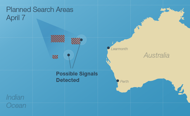
A cleaner, clearer version of the "Planned Search Areas" graphic. Designed by Jen Patel.
Executing strong information design is not difficult, but as CNN has illustrated, very poor information design is unfortunately easier to fall into than we might like it to be. A well-crafted, succinct headline deserves a clean and clear graphic.
About Involution Studios
Involution designs and builds exceptional software for innovative and visionary companies. We specify, architect, design, and develop applications for web, mobile, desktop, devices, and emerging technologies. Involution deploys small and experienced teams to create applications that are highly usable and appropriately beautiful. Founded in 2004, complex, mission critical software has always been our business. We've produced high-quality applications that are being used every day by over 150 million people. Our clients include Apple, AstraZeneca, 3M Health Information Systems, McAfee, Microsoft, Oracle, Personal Genome Project, Partners HealthCare, and US Department of Health and Human Services.