The Health Design Challenge, sponsored by the Office of the National Coordinator for Health Information Technology (ONC) and the Department of Veterans Affairs (VA), is encouraging the UX design community to rethink the presentation of the medical record in order to create a better patient experience. The objectives are to design a usable, beautiful medical record that enables patients to more easily manage their health, and health professionals and caregivers to more effectively understand and use patients' health information.
The current instantiation of the Blue Button health record, originally created by the VA, is unwieldy because of a lack of clear visual hierarchy, aesthetic presentation, and information design. It has all the charm of a cash register receipt from the 1980s, but with 100x the critical information density and half the legibility. There's no doubt that a well-designed medical record has the potential to provide many positive outcomes, including improved care coordination, prevention of medication errors, and quick, on demand access to critical health information in emergency situations.
The most innovative designs from the Health Design Challenge will be showcased in an online gallery and at a physical exhibit in Washington, DC. Most importantly, a final hybrid design — that may contain elements of many different designs — will be built and open-sourced on Github. With the final design available as open source, EHR developers will be able to easily integrate it into their products, enhance it as needed, and optimize it to serve specific patient populations.
hRecord and hGraph
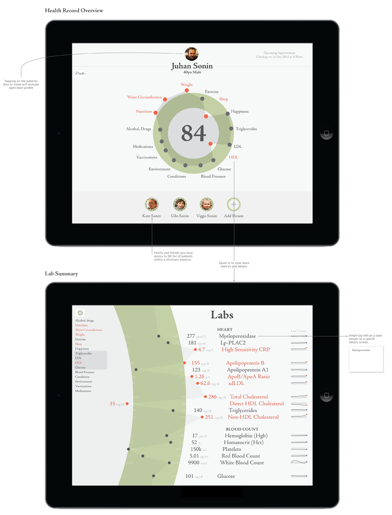
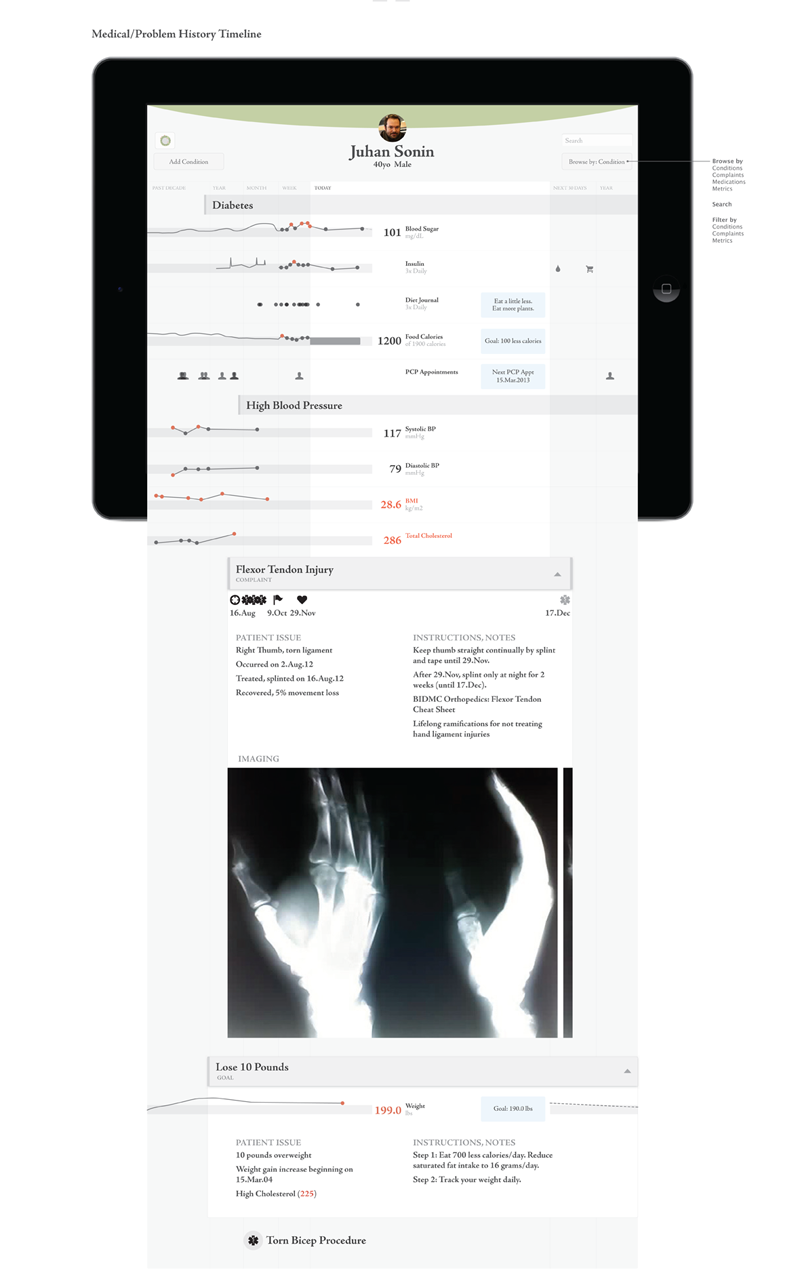
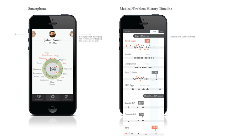
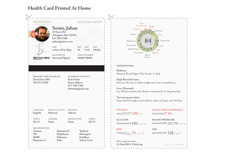
Involution has long been involved with the design of open source solutions for the healthcare industry. For the Health Design Challenge, Involution designed hRecord, a dynamic, system view of your health, based on our open source design work for hGraph. We're sharing a sample of our hRecord designs here including versions for iPad, iPhone, and print. You can also view our complete Health Design Challenge submission.
In order to gain insight into the complex, multi-dimensional data sets that represent health metrics, healthcare data requires visual representations that are engaging, optimized for use by both the health care provider and the patient, and support high-level pattern recognition and analysis as well as the ability to see deeper details.
hGraph is a open source information visualization particularly well-suited for viewing complex data, which provides a complete overview of an individual's health. This single picture method can have a profound effect on a person's understanding of their total well-being, because it compiles multiple metrics into a unified graph that can be viewed at a glance.