Like many of you, we don’t differentiate that much among work, learning, and play when we’re surfing the interwebs. Whether it’s TweetDeck, RSS feeds, Facebook, or another of the innumerable info-streams we monitor, we come across intriguing content that inspires, informs, amuses, and even appalls us. So, now that we’ve got your attention, here’s what made the rounds at Involution Studios this week:

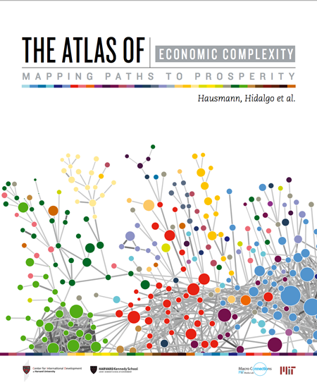
The Atlas of Economic Complexity: Mapping Paths to Prosperity—From The Observatory of Economic Complexity, which makes international trade data and economic complexity indicators available through millions of interactive visualizations. A downloadable pdf, the Atlas"attempts to measure the amount of productive knowledge that each country holds" and does so through clean, beautiful information graphics. Interactive versions of the data graphics are also provided on website. We wish there were health indicators built in, but it's very cool nonetheless.

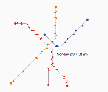
Visualizing MBTA Data—An interactive exploration of Boston's subway system. The "T" as we call it is the oldest subway system in the country, built in a city that wasn't exactly laid out in sensible grid. As a result, it can be a little confusing, to say the least, to figure out how to get around the city by rail. Nonetheless, around 425,000 people, on average, test their mettle on the T every weekday. Now they, and you, can see what's happening in the system in real time as well as see the patterns and trends on all four lines throughout the day. Send this to your UI-designer friends—it will make their day just to play with the data-driven graphs!

LightUp—Augmented reality to help build electronics. Another one of the dozens of magnetic electronic kits for kids to use. The difference is this one has a smartphone app that lets you take a picture of your circuit and diagnose problems or visualize how the electrons are flowing. (The app was built in Boston as well.) Take a look at the demo.