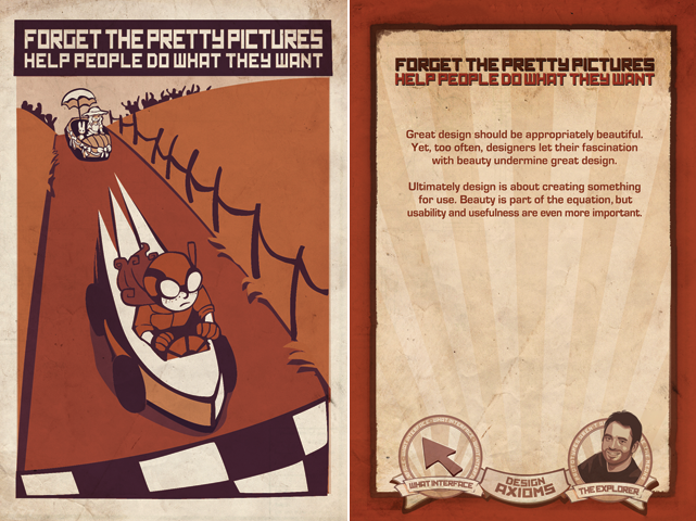
One week this past summer, I followed designers Ben Salinas and Roger Zhu around the studio, snapping pictures with an eye toward capturing their process in a (relatively) non-invasive way. As I looked through my collected shots I realized they needed a context. So, like any smart designer, I turned to the Design Axioms.
It was actually a little hard to choose only one axiom, but I settled on this one: Forget The Pretty Pictures: Help People Do What They Want. My pictures aren’t all that pretty, but they do show the bare-bones workflow that Ben and Roger followed to deconstruct and analyze a project in the works. Here are a few of my observations from this simple exercise.
Involution designers frequently start out with some sort of category tree to identify user tasks, look for patterns, and generate questions to discuss with the client.
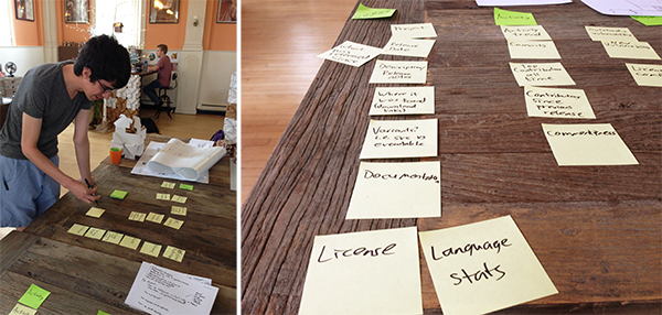
Sticky-note card-sorting make it easy to categorize tasks and information elements. One day these notes may become a navigation menu.
Sketching doesn't have to wait until after all of the categorizing is done—sometimes drawing diagrams helps you to see relationships and patterns in ways that words don't always convey. (For more on sketching, read Five Reasons to Sketch Your User Interface.)
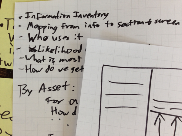
An early sketch begins to take shape.
During iterative design and review, Involution designers meet directly with the clients in a collaborative process to refine the foundational concepts.
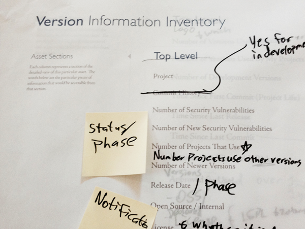
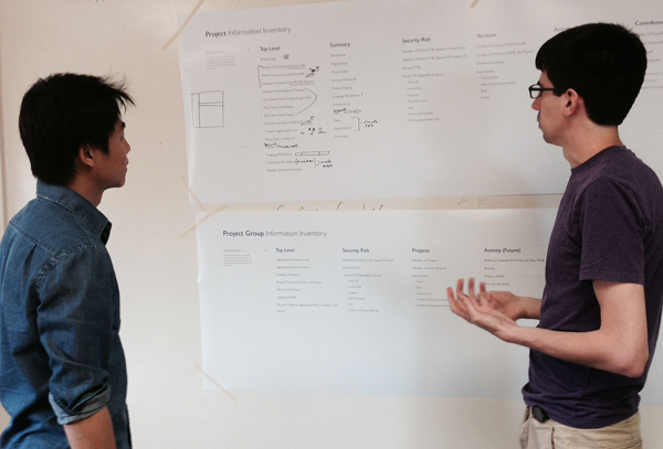
Blueprints lay the foundation for another round of notes. Still not committing to pretty pixels—a project blueprint helps designers to generate feedback directly from clients, who can write and stick notes directly on the comp without worrying about ruining anything.
The designers use the insights and feedback gleaned from weekly client design reviews to inform the next round of design decisions.
Our studio walls are coated with whiteboard paint, which makes it easy to extend the discussion literally beyond the limits of the paper copy. Designers often take pictures of each stage before updating the next version in pixels.
Throughout these initial stages of the design process, the focus is on what the user needs to do. Elegance and beauty wait in the wings.
