What I did on my summer vacation:
After three years of studying biomedical engineering at Johns Hopkins, I wanted to expand my gaze. At school, I devote most of my time to developing medical devices (when I’m not studying, of course). Spending last summer fixing medical equipment in Rwanda sparked my interest in examining healthcare more broadly. I came to Invo this summer hoping to learn design principles, develop a deeper understanding of how healthcare works, and learn how to build a website. These goals only scratch the surface of what I ultimately learned.

First Project:
On the first day, I teamed up with Cecile Lu, another intern studying Architecture at MIT, to work on a project called “Health in the Home.” We were tasked with envisioning what it will look like when medical technology becomes integrated into the home. Just over two decades old myself, predicting the future ten years down the road was a challenge. Cecile and I spent nearly two weeks going room by room—from bathroom all the way to garage—mocking up what the future looks like. We wanted to make it exciting but also realistic. After extensive research and sketching, we produced a vision for each room of the home, ranging from DNA sequencers in the bathroom sink to microphones and cameras for gait analysis in the hall.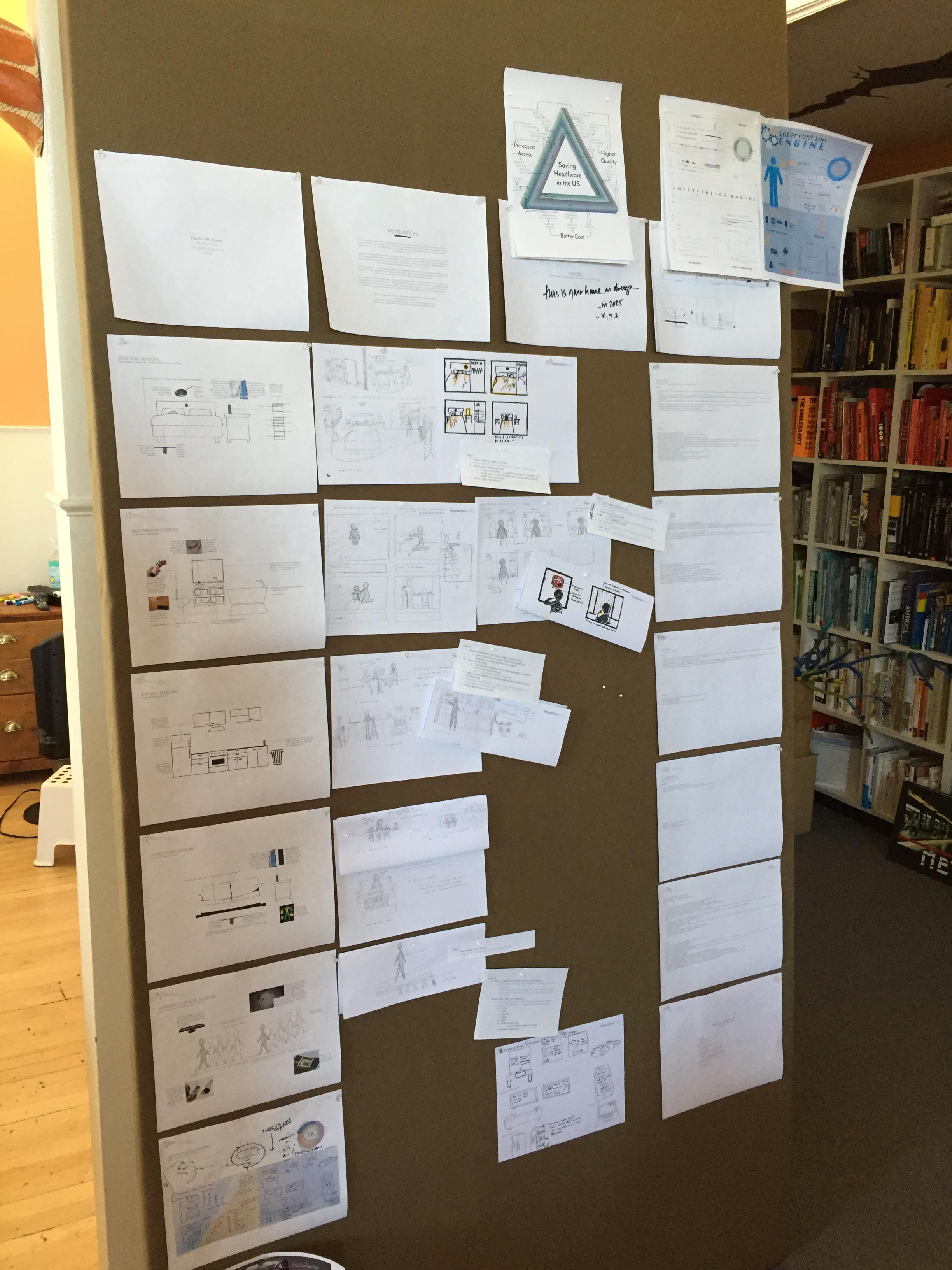
Transition Project:
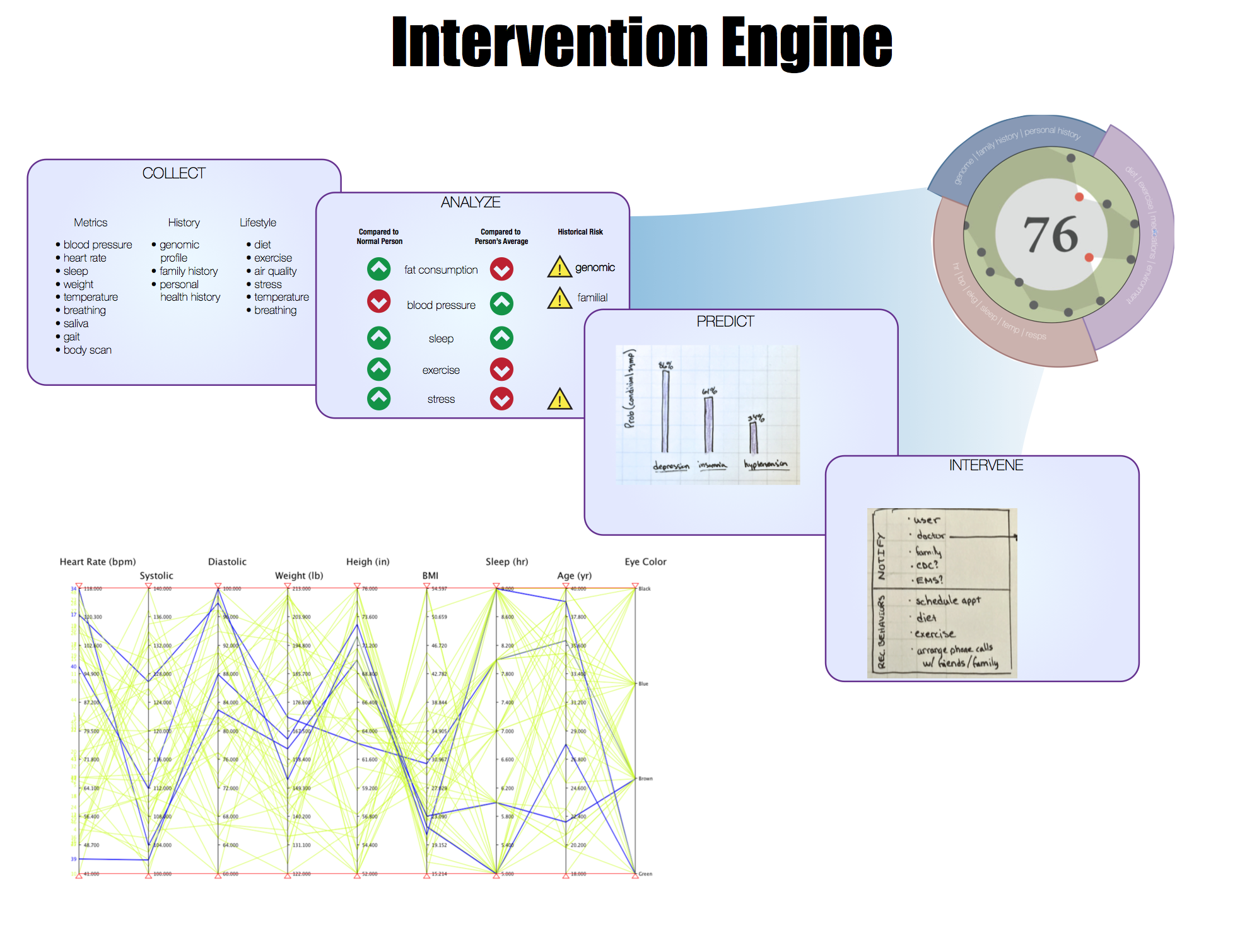
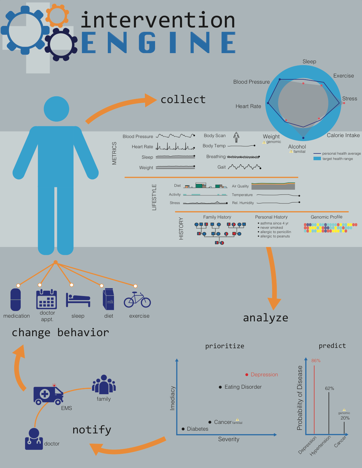
Before we could start translating our sketches into composite video, we realized we needed to motivate the project. Why should anyone want a DNA sequencer in their home? And how does that help their well-being? We started by thinking about how an “intervention engine” could use the information collected by the home to improve a person’s health. After some initial sketches, I dove into Adobe Illustrator for the first time. My initial attempt left a lot to be desired. As did the second. By the third attempt, I was at least getting a handle on how to make Illustrator do what I wanted it to do.
Meanwhile, Cecile used her design talents and vast Illustrator skills to put my attempts to shame.
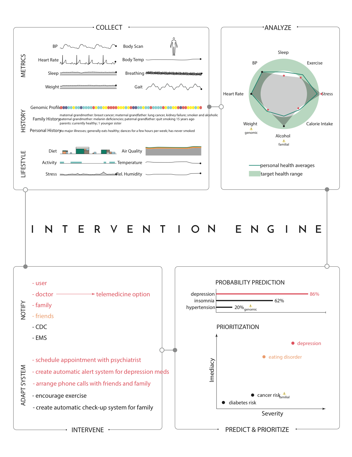
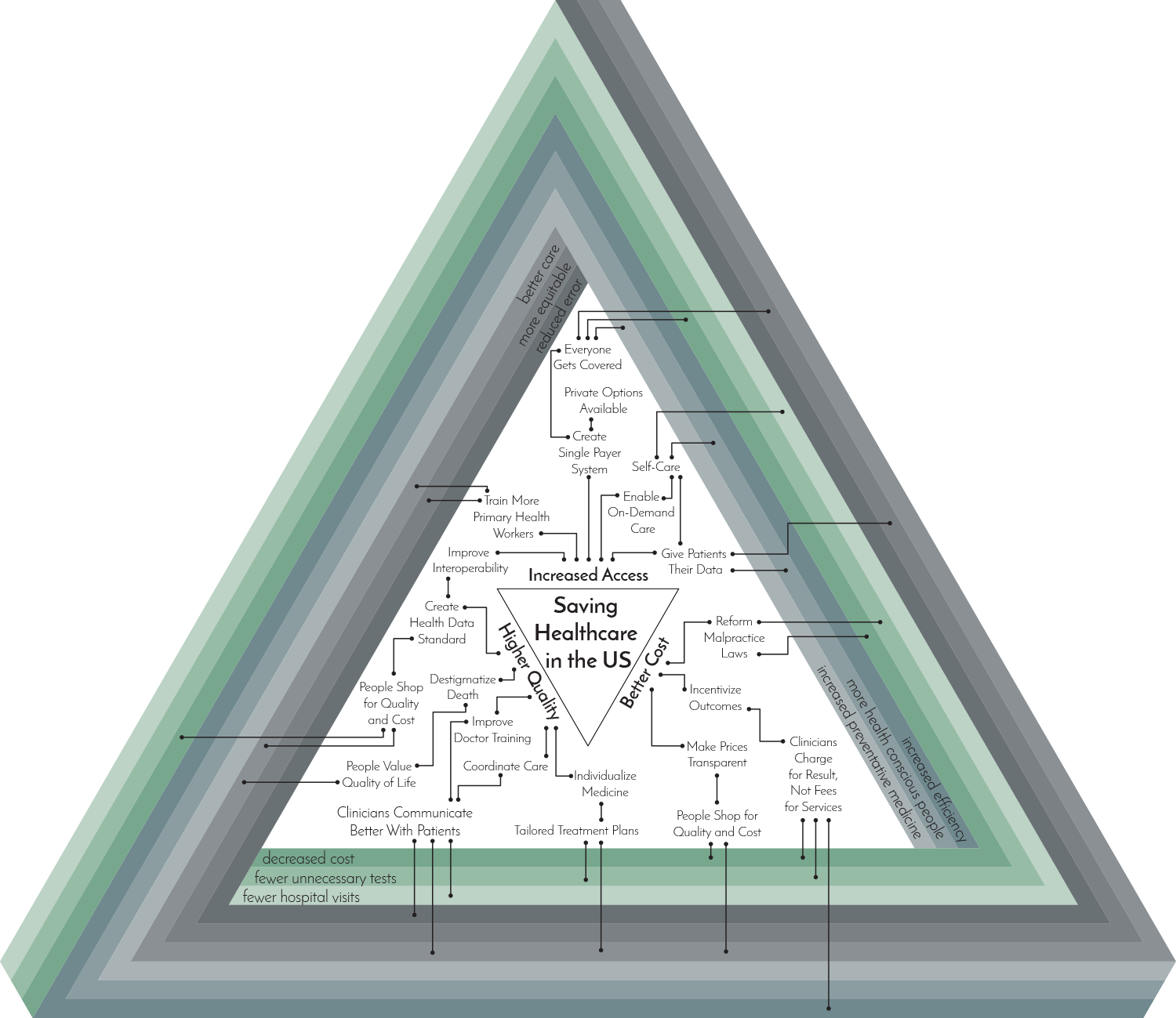
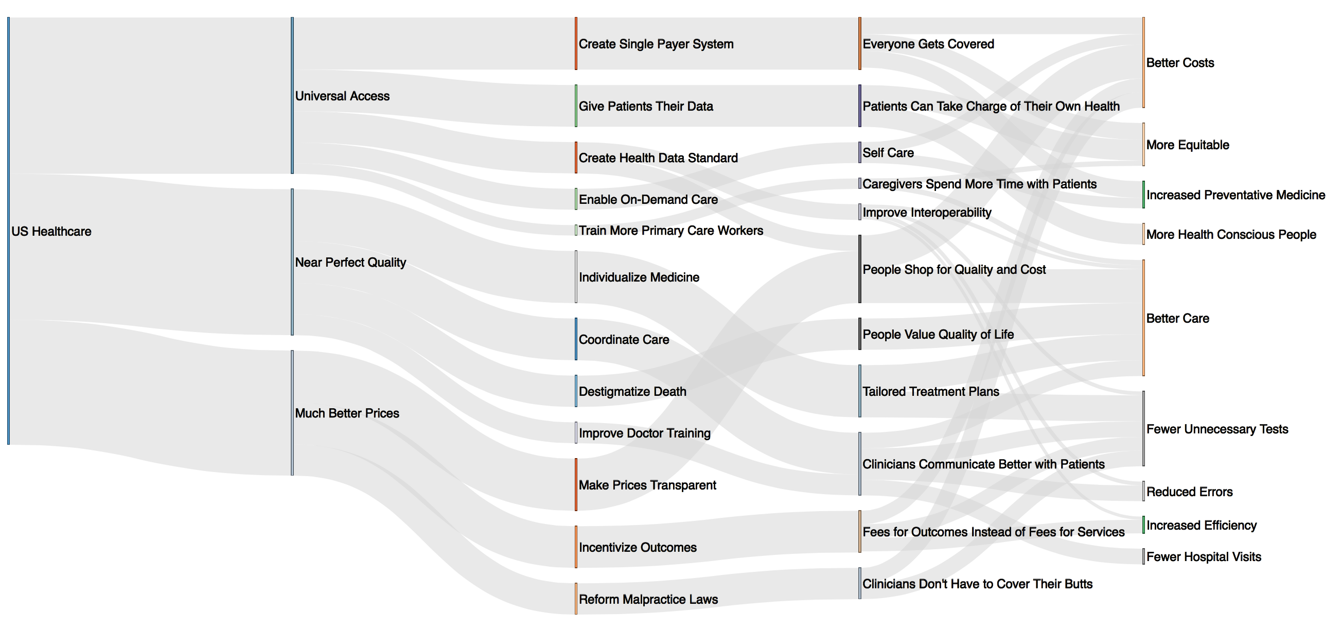
Now that we had an idea of how an intervention engine might work, we wanted to articulate why it would improve healthcare. We started by examining the current healthcare system. Together with Juhan, the studio director, I began mapping out how to improve healthcare access, quality, and prices. The result was a graphic that depicts the intertwining challenges and proposed solutions. My Illustrator skills were getting better, but still not at Cecile’s level.
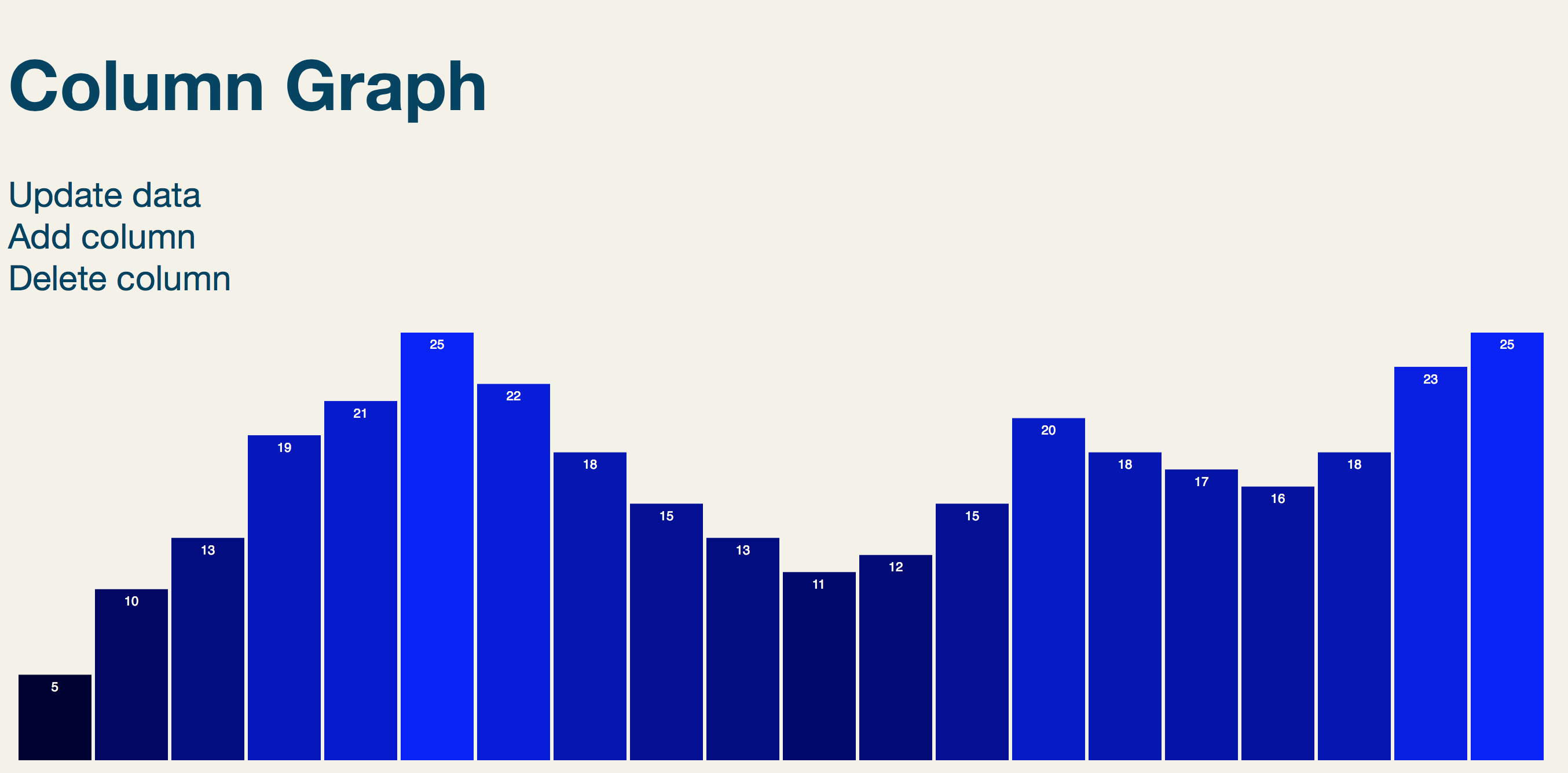
After creating the graphics, we realized that the message couldn’t be fully conveyed with something static. Time to turn pixels into code. Enter D3. Prior to Invo, my programing experience comprised one Python introductory class and homework assignments in MATLAB. In order to learn D3, I also had to pick up HTML, CSS, and JavaScript—all at the same time. After three days, I scrapped together a modest column graph using randomly generated data.
Two days later, Cecile and I were making graphs with our actual data.
Then we realized that our charts needed context. Someone looking at the charts would be pretty confused without some sort of description. We decided to shelve the Health in the Home project and fully devote ourselves to this new project.
Second Project:
The plan: write a few paragraphs that describe the healthcare chart, and maybe throw in some data about current costs and quality. Easy, right? Six weeks later, our ‘feature article’ is finally ready.
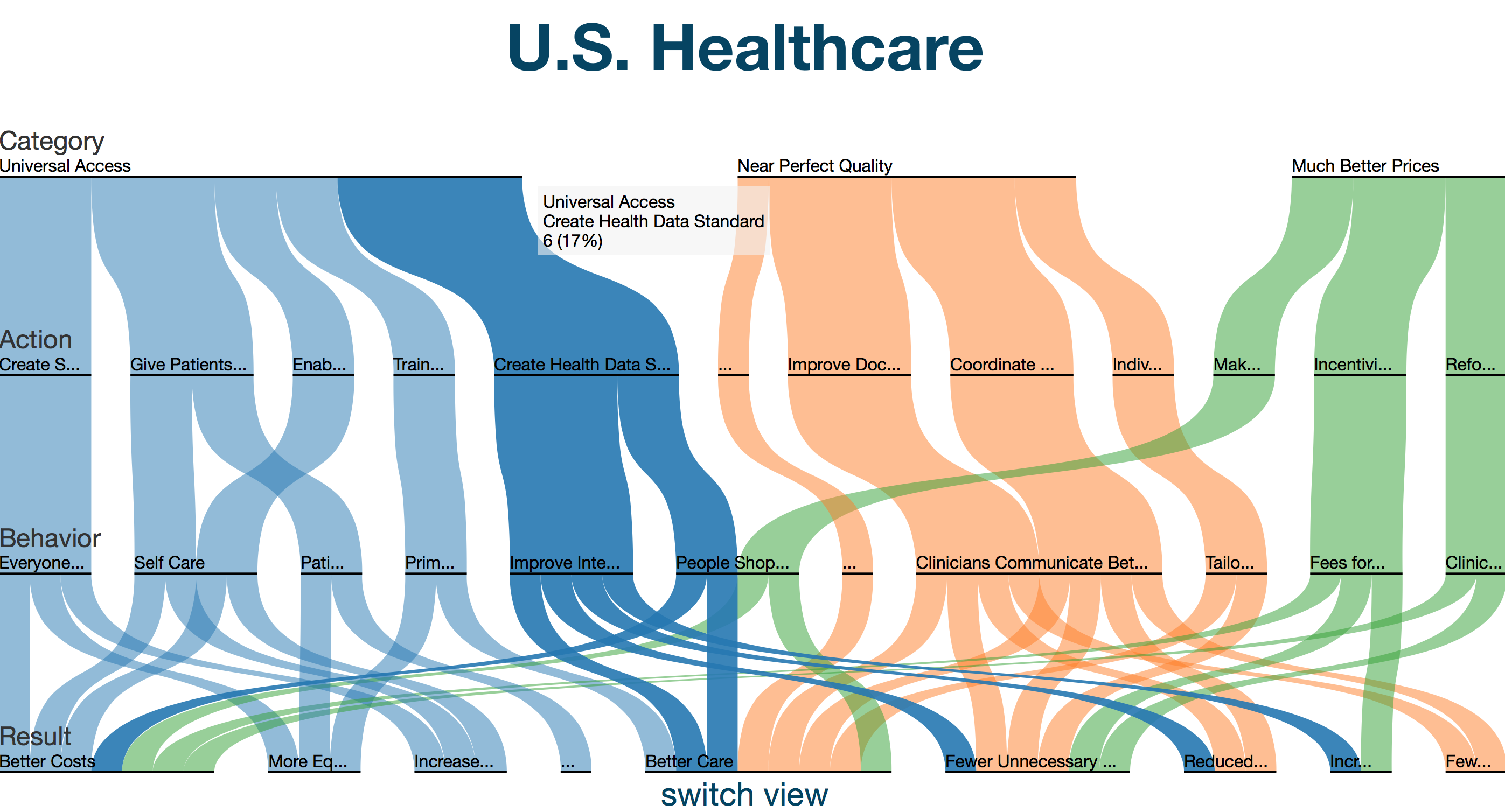
My original D3 column graph chart grew into this:
Cecile’s healthcare chart grew into this:
To introduce the need for improvement, we wrote a story about a patient who endures some of the pitfalls of the current healthcare system. Then we added some graphs to help explain the cost, quality, and access data.
Every time we finished a section of the article, we decided something was missing. First it was ‘pop-outs,’ which we used for defining key terms. The graphs needed axes, and then transitions. How about a map of different hospital costs? What about a navigation bar? A timeline describing the history of reform efforts? Obviously the feature needed a medical bill that updates as you scroll.
Then there were the less exciting challenges, like making the entire site (including the D3 charts) fully responsive. Before, I didn’t even know that different browsers display sites differently…yet another challenge.
It was well worth-it. Not only is the finished product polished, but it conveys an important message about healthcare.
http://www.goinvo.com/features/us-healthcare/
What I learned
In eight weeks, I learned a lot. I now have experience with HTML, CSS, JS, D3, HAML, SASS, and GitHub. I know my way around Adobe Illustrator, and of course Slack. I also learned a tremendous amount about how healthcare works (and doesn’t). Ultimately, the experience left me humbled by how much I still have to learn.
PS: Fun
It’s not all fun and games at Invo, but it mostly is. In addition to doing work every now and then, we…
ate lunched prepared by a studio member every week (Cecile on the left, Neil right),
went bowling together,
and cultivated an indoor, hydroponic garden (through a Grove).
Now that's a summer!