Each and every spring, the Finance Committee of Arlington sends the town's upcoming budget to a representative Town Meeting where the budget is debated, amended and eventually approved. This April, the Town worked with Involution to create a new tool — Arlington Visual Budget — to represent and make sense of the valuable, complicated financial data.
In the beginning of March 2013, Andrew Flanagan, Mike Bouton, Annie LaCourt and Alan Jones of Arlington's Town staff engaged with us (Roger Zhu and Ivan Di Lernia) to imagine and develop a new way to represent their financial data. It was exciting because we hadn't worked in this area before. It was a blank canvas. In our first meeting we met with the team from Arlington and they explained that all the financial data is currently open to public, but even citizens well-versed in finance could not interpret the data through texts and tables alone. They needed a product that was able to tell the town’s financial story in a way that hadn’t been attempted before—by deciphering the town’s balance sheet in a visual, interactive way.
With that goal in mind, we began to sketch, prototype, and experiment with designs that would understand the layers and hierarchy of the data. One early design featured a zoomable partition layout. The design made the budget highly interactive and clearly articulated the hierarchy of each layer of data. We loved it!
But when we entered the data and populated the visualization we realized our approach wasn’t working as we had imagined. The data hierarchy and interaction worked as we’d intended, but because some of the numbers were very big and the others too small, the details of the data were handicapped by our design. We realized we’d put too much emphasis on the user. We needed to pay more attention to the content of the budget and center our visualization around the data itself.
On our first attempt, we found that users couldn't properly see data that was more than two layers deep.
Luckily, with the data in the system we could begin experimenting again. We tried Sanky charts and bubble charts in order to find a design that worked with the data and was also easy to understand. We reached out to our friend Katy Harris at Fathom who gave us some much-needed critiques.
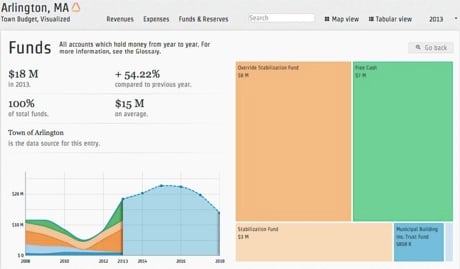
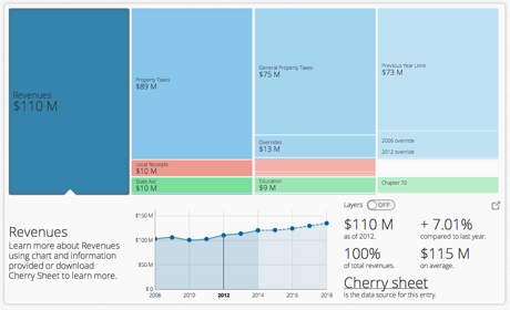
After several iterations we landed on tree maps, a visualization technique invented by Professor Ben Shneiderman. We found this design was easy for most users to understand. They could zoom into the deeper layers to see small data and zoom out to see the financial plan as a whole. The design represented both big and small numbers in our data set, no matter which layers we were on, so users could see accurate data down to it’s finest detail.
We showed our prototype to the town of Arlington's team and watched as they interacted with their familiar data in a completely new way. They were surprised and delighted with how the data looked. It now told the story of their town. They were engaging with the numbers not as financial planners, they were playing with the budget like everyday citizens.
We learned a great deal from the back-and-forth process of this project. As designers and engineers, we had been taught to approach a problem from a human perspective, but in this project we also needed to focus our design around the data, to treat the numbers like “users”, and evolve designs around it.
Arlington will launch the Visual Budget during a town hall on September 21, 2013. We hope the Arlington Visual Budget will help make the citizens of Arlington more informed and engaged about the financial health of their town.
- Ivan & Roger
Treemaps provided a clearer way to see the smaller subsets of data.