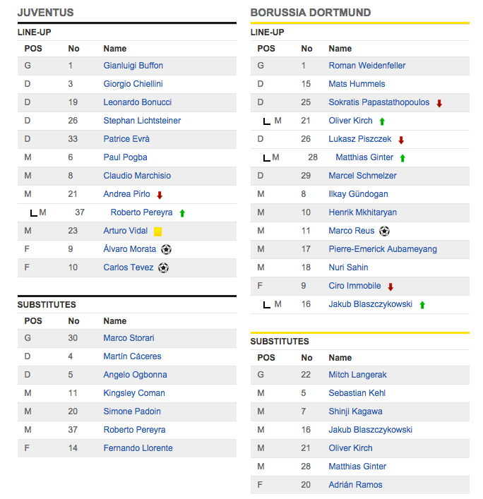
As my World Cup Feature surely indicates, I’m rather a big fan of what the non-American world calls “football.” So it was that, yesterday, I had the ESPN feed for the Juventus-Dortmund game up alongside my work.
While trying to parse through the substitution information, I noticed a rookie mistake in how the sports organization presents team rosters. Take a look for yourself.
If you start by looking at the SUBSTITUTES tables, you will notice that ESPN uses alternating grey and white rows in listing a team’s roster. At the start of the game, each team’s LINE-UP was laid out the same way. While there may be better ways to present a team roster, the changing of background colour to more explicitly differentiate within a list is a valid design choice. It is certainly preferable to using a single color on an otherwise Spartan list.
The problem for me as a viewer of ESPN’s data is that, when a team substitutes out a player, the substitute's information is always presented on a white background, regardless of where it falls in the table. This creates visual inconsistency in the established alternating-row pattern. Based on the initial presentation, one expects each player to be distinguished by color from the player/row above and beneath.
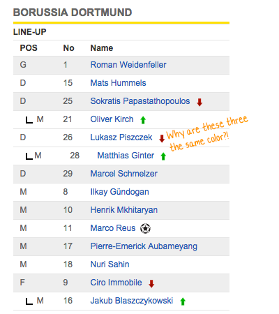
From a layout perspective, ESPN’s method for showing a substitution relationship works. The substitute's information is associated with the player they replaced by a connecting line and indented representation of their position. Let’s explore how they could use background colour for these substituting players:
Method 1. Always use white (as ESPN does) or grey for ALL replacement players. This irrevocably breaks the established pattern of alternating grey and white rows and creates illogical visual connections. A white-backgrounded replacement is connected to a grey player they replaced, but the white-backgrounded substitute appears directly above another white-backgrounded—but unrelated—player. Or, more sensibly, sometimes the white-backgrounded replacement happens to be replacing a white-backgrounded player, in which case there is a logical visual connection that reinforces the original pattern. But it is entirely inconsistent: sometimes the replacement fits ESPN’s pattern and other times it does not.
This next solution brings a bit more consistency to the view.
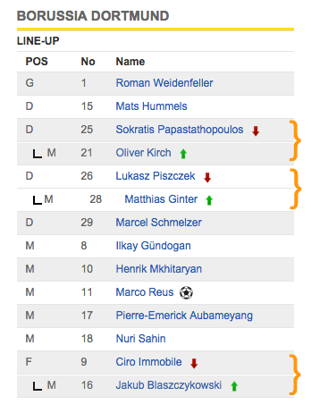
Player/sub pairs are bracketed in orange for emphasis only. The brackets are not intended for inclusion in the UI design.
Method 2. Always use the same coloured background for both replacement and player, regardless of the row color in the Line-Up. This is consistent with ESPN’s basic alternating colour pattern, reinforcing the logic of that approach while providing at-a-glance understanding of who is on the field and their potential role in the team’s tactical setup.
Player/sub pairs are bracketed in orange for emphasis only. The brackets are not intended for inclusion in the UI design.
The third solution uses color to highlight changes in the line-up.
Method 3. Introduce a third background colour only for replacement players. This approach would highlight replacements and would again reinforce the logic of ESPN’s original alternating scheme. White and grey would continue to be used in an alternating fashion with the deviation from the pattern always clearly indicating “this player (with the new background color) replaced the player above him.”
Which solution to ultimately choose is largely a product of ESPN’s art direction and the other graphics they choose in their presentation of football games. Given that context, I would probably go with Method 2, which is understated, keeping the colour range largely in blacks and whites.
While small information design problems like this ESPN example might not seem like a big deal, they are like paper cuts of varying acuteness. As one poor choice piles atop the next, it compounds into something that meaningfully detracts from the overall quality of experience.